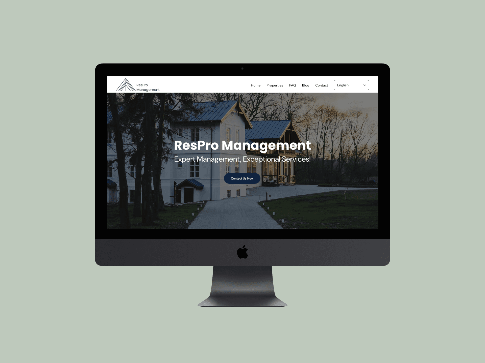
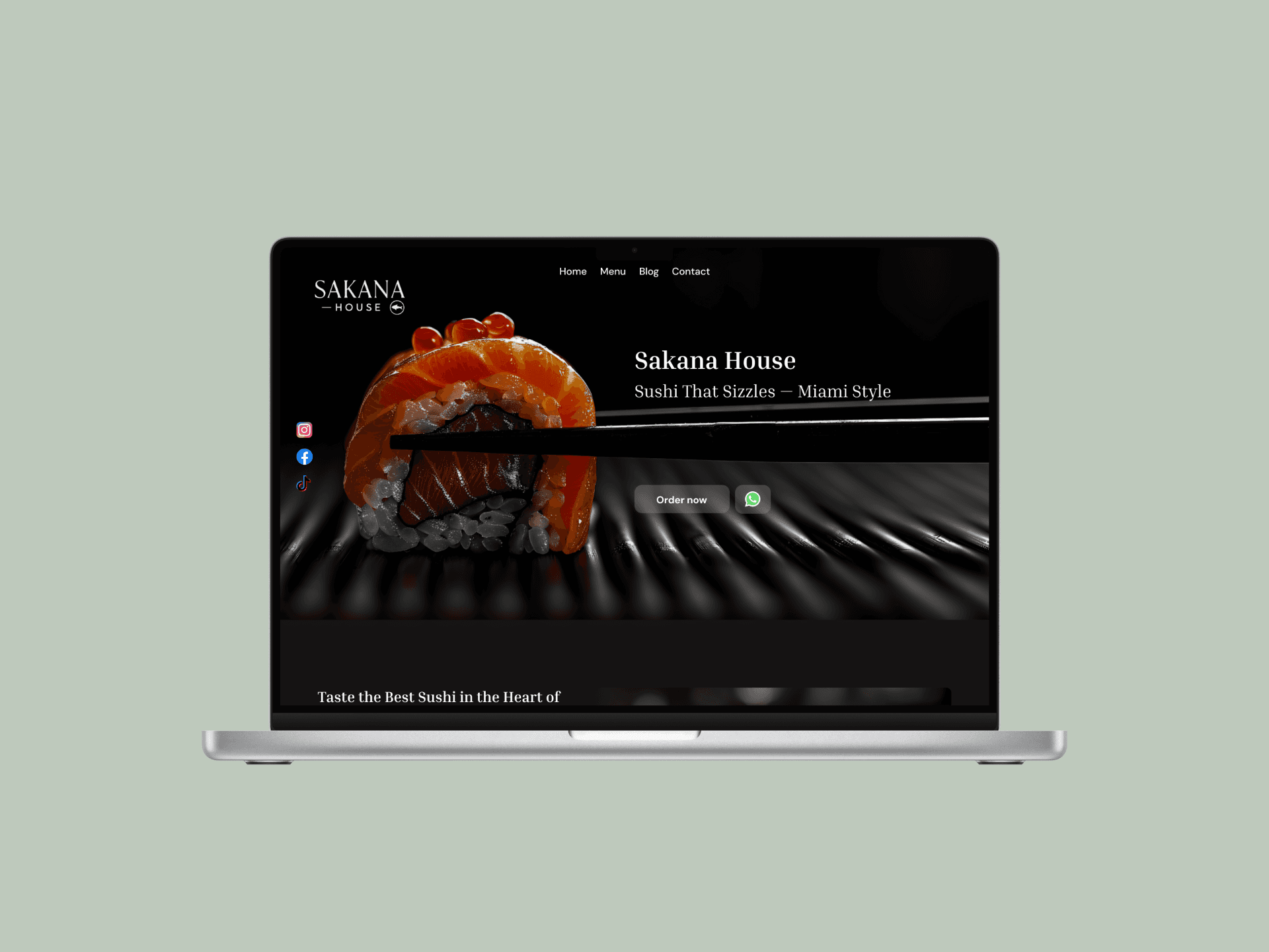
Sakana House
Responsive website design for Sakana House, a contemporary Japanese fusion restaurant offering an elevated dining experience inspired by modern Tokyo aesthetics.
Project Overview
Role: UX/UI Designer
Platform: Coded (By work partner)
Tools: Figma,
Client Location: Miami, FL
Industry: Food Industry
Scope: Website design + build, content strategy, basic brand direction
Goal: Create a clear easy to navigate website where users could order food

Project Overview
Role: UX/UI Designer
Platform: Coded (By work partner)
Tools: Figma,
Client Location: Miami, FL
Industry: Food Industry
Scope: Website design + build, content strategy, basic brand direction
Goal: Create a clear easy to navigate website where users could order food
Problem Statement
Sakana House needed a digital presence that matched the quality of their dining experience. Their existing online channels didn’t clearly communicate the menu, lacked a seamless way for customers to place sushi orders, and didn’t provide an intuitive structure for exploring their offerings. Users often struggled to find essential information such as prices, specials, and ordering options, which affected both customer satisfaction and online sales.
Goal Statement
The goal was to design and launch a responsive, accessible website that allows customers to order sushi online with ease. The experience needed to be intuitive, visually appealing, and optimized for fast browsing—providing clear menu navigation, smooth ordering flows, and a modern interface that reflects the restaurant’s contemporary Japanese identity.
From Concept to a Digital Product
Designed a fully responsive website for both desktop and mobile to support a smooth, seamless ordering experience.
Structured the site around the restaurant’s key touchpoints, including the home page, full menu, product details, and ordering flow.
Designed a total of 10 high-fidelity pages: Home, Menu, Blog main page, three internal blog articles, Contact, Product page, Checkout, and Payment page.
Developed a clean, modern visual system inspired by minimalist aesthetics to ensure clarity, elegance, and ease of navigation.
Optimized the ordering journey with clear calls to action, intuitive menu organization, and a frictionless checkout experience.
Ensured accessibility, fast browsing, and mobile-first usability to support customers ordering sushi on the go.
Final Outcome
A clear and structured design, thoughtfully aligned with the brand and its audience.


See More of my Work
A clear and structured design, thoughtfully aligned with the brand and its audience.